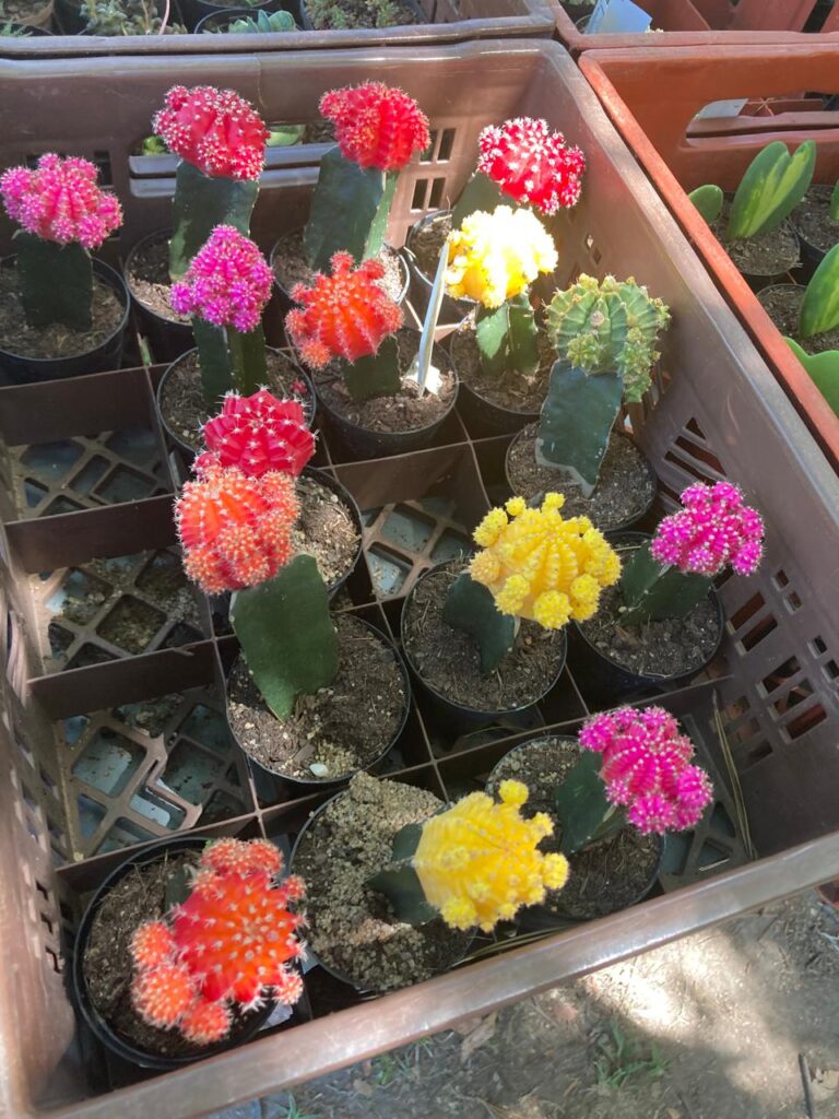
Colors are more than just visual elements; they evoke emotions, shape perceptions, and influence behavior. Whether in design, fashion, or interior decor, the use of color plays a vital role in setting the tone and mood of a space or message. Understanding the significance of each color can help us make informed decisions about how and where to use them effectively. Here’s a breakdown of the significance of key colors, their meanings, and the best places to use them.
- Red: The Color of Energy and Passion
Meaning: Red is a bold and intense color associated with energy, passion, love, and power. It stimulates strong emotions and grabs attention, often signifying urgency or importance. It can also represent danger or warning.
Best Places to Use:
Dining Rooms and Kitchens: Red is known to stimulate appetite, making it ideal for these spaces.
Marketing and Branding: Red is often used in advertising to create a sense of urgency or excitement.
Living Rooms or Accent Walls: As a strong color, it can energize a space when used in moderation.
- Blue: The Color of Calm and Trust
Meaning: Blue evokes feelings of calm, trust, and professionalism. It’s often associated with serenity, loyalty, and wisdom. Lighter blues are linked to tranquility, while darker blues convey strength and stability.
Best Places to Use:
Bedrooms and Bathrooms: Blue promotes relaxation, making it an ideal choice for spaces meant for rest and renewal.
Offices and Workspaces: Blue enhances focus and productivity, creating a calm, professional atmosphere.
Branding for Trustworthy Brands: Many corporations use blue in their logos to instill a sense of trust with customers.
- Green: The Color of Growth and Balance
Meaning: Green symbolizes nature, growth, balance, and harmony. It’s a color that promotes relaxation and health, representing renewal and vitality. Green is also associated with wealth and prosperity.
Best Places to Use:
Living Rooms and Offices: Green can create a balanced and peaceful environment, ideal for both relaxation and workspaces.
Health and Wellness Spaces: Whether in spas or clinics, green conveys a sense of well-being.
Gardens and Outdoor Areas: It connects with the natural environment, enhancing the serenity of outdoor spaces.
- Yellow: The Color of Optimism and Happiness
Meaning: Yellow is the color of optimism, creativity, and energy. It is often associated with sunshine, happiness, and positivity, but in excess, it can also cause feelings of frustration or anxiety.
Best Places to Use:
Kitchens and Dining Areas: Yellow’s energizing and uplifting nature makes it a great choice for these spaces.
Creative Spaces: It encourages creativity and innovation, so yellow is perfect for studios, art rooms, and brainstorming areas.
Accents and Decorative Pieces: Use yellow as an accent color to add warmth and vibrancy to a space.
- Purple: The Color of Royalty and Luxury
Meaning: Purple is often linked to royalty, luxury, spirituality, and creativity. Historically, it was an expensive color to produce, which is why it became associated with wealth and power. It also evokes feelings of mystery and elegance.
Best Places to Use:
Bedrooms: Purple can create a serene, calming environment while also adding a touch of luxury and sophistication.
High-End Spaces: If you want to add a sense of opulence, purple is an excellent choice for luxury retail stores or boutique hotels.
Artistic or Creative Studios: Purple encourages creativity and imagination, making it ideal for artists or designers.
- Orange: The Color of Enthusiasm and Warmth
Meaning: Orange is a lively, energetic color that represents enthusiasm, warmth, and creativity. It’s less intense than red, but still vibrant and attention-grabbing. It can evoke feelings of excitement, optimism, and friendliness.
Best Places to Use:
Living Rooms or Entryways: Orange creates a welcoming and dynamic atmosphere, ideal for social spaces.
Exercise Areas or Gyms: Orange’s energizing quality makes it a good choice for spaces where activity and motivation are key.
Children’s Rooms: It’s playful and fun, making it a great color for kids’ bedrooms or playrooms.
- Pink: The Color of Compassion and Romance
Meaning: Pink is a gentle, soothing color associated with love, compassion, and femininity. It conveys warmth, tenderness, and caring, and is often used to evoke feelings of romance and calm.
Best Places to Use:
Bedrooms and Personal Spaces: Pink creates a calm, nurturing environment, making it ideal for bedrooms and personal retreats.
Spas and Wellness Centers: Pink promotes relaxation and can create a peaceful ambiance for spas and wellness spaces.
Gifts and Celebrations: Pink is often used in gifts, cards, and party decor to convey thoughtfulness and affection.
- White: The Color of Purity and Simplicity
Meaning: White represents purity, simplicity, and cleanliness. It evokes clarity and freshness and is often used to create a minimalist, open atmosphere. It can also symbolize new beginnings and innocence.
Best Places to Use:
Bathrooms and Kitchens: White promotes cleanliness and a fresh feel, making it a great choice for these spaces.
Minimalist Interiors: Use white to create a clean, uncluttered look in modern and minimalist interiors.
Branding for Luxury or Professionalism: White is often used in high-end or professional branding to convey elegance and sophistication.
- Black: The Color of Sophistication and Mystery
Meaning: Black is associated with sophistication, mystery, power, and elegance. It can also evoke feelings of seriousness or even sadness, depending on its context. Black is often used to convey authority and timelessness.
Best Places to Use:
Formal Events and Fashion: Black is a classic choice for evening wear, formal events, and luxury branding.
Accent Walls and Furniture: In interior design, black can create a dramatic, elegant atmosphere when used for accent walls or furniture.
Offices and Corporate Spaces: Black is often used in corporate settings to convey professionalism and authority.
- Brown: The Color of Stability and Warmth
Meaning: Brown is a warm, earthy color that signifies stability, reliability, and comfort. It is connected with nature and often evokes feelings of warmth, safety, and groundedness.
Best Places to Use:
Living Rooms and Dining Areas: Brown creates a cozy, inviting atmosphere, making it ideal for family spaces.
Wooden Furniture and Decor: Brown is naturally associated with wood and natural materials, so it works well in rustic or earthy decor.
Offices: Brown can create a grounded and reliable environment in workspaces.
Conclusion
Each color has its own distinct significance, and understanding these meanings can help us make conscious choices in how we use them. Whether designing a room, choosing an outfit, or creating a brand identity, color is a powerful tool that can influence moods, behavior, and perceptions. By using colors thoughtfully, we can enhance experiences and create spaces that truly reflect our intentions.
Leave a Reply